Edit your content
The beta version now includes the TipTap visual editor (default), the Monaco code editor, and the new Form-based editor for YAML/JSON files and frontmatter. You can switch between them at any time using the editor mode toggle in the toolbar.
Nuxt Studio offers a versatile workspace for both developers and content writers, giving them the freedom to choose between our different editors:
- Notion-like editor for
Markdownfiles - Form editor for
YAMLandJSONfiles - Code editor for any kind of files (for technical users only)
Each editor serves its own purpose. Some users prefer visual editing, while others prefer direct code manipulation. At the end, Markdown and MDC syntax is the final output for both editors, with seamless conversion between visual and code modes.
Editor Mode Switching
You can switch between the visual editor and code editor at any time by clicking the actions dropdown in the file header (on the right of the breadcrumb):
- Visual Mode - Notion-like editing experience for Markdown and Form editor for YAML/JSON files.
- Code Mode (Monaco) - Direct Markdown/MDC syntax editing
Your preference is saved and will be used for all files.
TipTap Visual Editor (Markdown files)
The TipTap visual editor provides a modern Notion-like editing experience for Markdown content, powered by the popular TipTap editor integrated by Nuxt UI Editor.
Key Features
- Rich Text Editing - Format text with headings, bold, italic, strikethrough, code, links, and more
- MDC Component Support - Insert and edit custom Vue components directly in the visual editor
- Media Integration - Browse in media picker to insert images from your library
- Emoji Integration - Type
:followed by an emoji name to insert emojis, or use the slash command/emoji - Slash Commands - Type
/to access a menu of formatting options and components - Drag & Drop - Reorder content blocks by dragging them
- Link Editor - Floating popover for editing links with external link support
- Toolbar - Bubble toolbar appears when you select text, providing quick access to formatting options
- Real-time Conversion - Seamlessly converts between visual content and MDC/Markdown syntax
Working with Vue Components
One of the TipTap visual editor's standout features is its ability to integrate and edit custom Vue components directly within the editor interface.
Create and Integrate Custom Components
Developers can create visually complex components, and editors can use them without technical knowledge. The visual editor handles component integration seamlessly.
Create your component
Vue components need to be located in the /components/content folder to be available in Studio:
<template>
  <div class="flex items-start gap-3">
    <div class="flex items-center justify-center border rounded-lg p-1.5">
      <UIcon :name="icon" />
    </div>
    <div class="flex flex-col">
      <h3 class="font-semibold">
        <slot name="title" />
      </h3>
      <span>
        <slot name="description" />
      </span>
    </div>
  </div>
</template>

<script setup lang="ts">
defineProps({
  icon: {
    type: String,
    default: 'i-lucide-cursor-click',
  },
})
</script>
Use in Markdown with MDC syntax
Components can be integrated using MDC syntax:
::home-feature
  ---
  icon: i-mdi-vuejs
  ---
  #title
  Embedded Vue components
  #description
  Edit slots and props inside the visual editor.
::
Edit in the Visual Editor
All components in the /components/content folder are automatically available:
- Type
/anywhere while editing - Search for your component in the list
- Insert and edit component slots directly in the editor
- Props editing with visual interface coming in beta
Integrate External Library Components
By default, components from external libraries (like Nuxt UI) won't appear in Studio's component list. To make them available, set them as global in your Nuxt config:
export default defineNuxtConfig({
  hooks: {
    'components:extend': (components) => {
      const globals = components.filter(c => ['UButton', 'UIcon'].includes(c.pascalName))

      globals.forEach(c => c.global = true)
    }
  },
})
Debug Mode
Enable debug mode from the footer menu to see the real-time conversion between:
- TipTap JSON format
- MDC AST
- Final Markdown output
This is useful for understanding how content is transformed and to share troubleshooting.
Form Editor
The form editor is used for editing:
- Frontmatter in
Markdownfiles - YAML files
- JSON files
It eliminates the need to interact directly with complex file syntax. Instead, forms are automatically generated based on your collection schema definition.
Defining your form with zod Schema
Once the schema property has been defined in your collection, this will automatically generate the corresponding form on Studio interface.
export default defineContentConfig({
  collections: {
    posts: defineCollection({
      type: 'page',
      source: 'blog/*.md',
      schema: z.object({
        draft: z.boolean().default(false),
        category: z.enum(['Alps', 'Himalaya', 'Pyrenees']).optional(),
        date: z.date(),
        image: z.object({
          src: property(z.string()).editor({ input: 'media' }),
          alt: z.string(),
        }),
        slug: property(z.string()).editor({ hidden: true }),
        icon: property(z.string().optional()).editor({ input: 'icon' }),
        authors: z.array(z.object({
          slug: z.string(),
          username: z.string(),
          name: z.string(),
          to: z.string(),
          avatar: z.object({
            src: z.string(),
            alt: z.string(),
          }),
        })),
      }),
    }),
  },
})
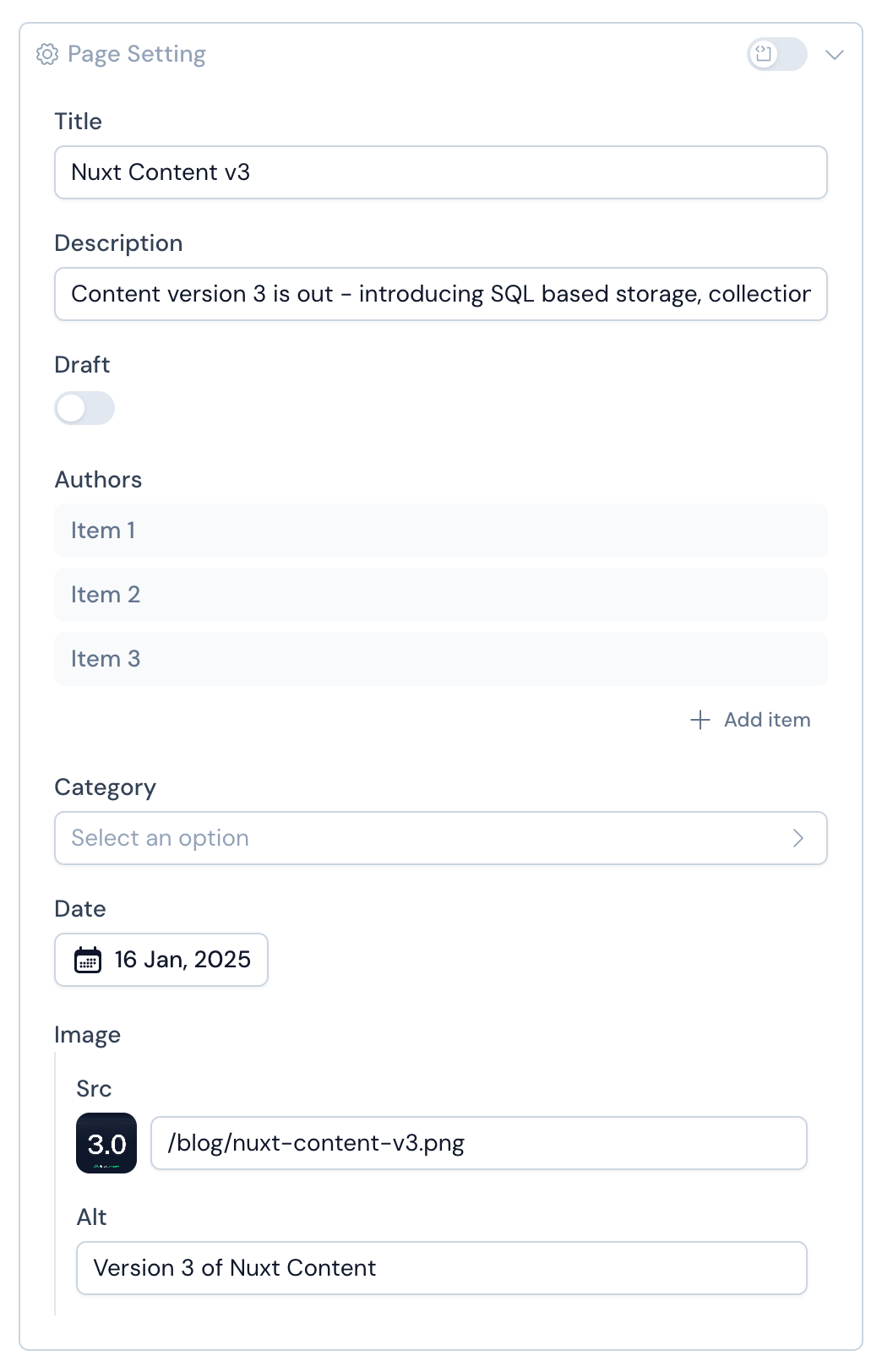
Native Inputs Mapping
Primitive Zod types are automatically mapped to appropriate form inputs in:
- String → Text input
- Date → Date picker Coming Soon
- Number → Number input Coming Soon
- Boolean → Toggle switch Coming Soon
- Enum → Select dropdown Coming Soon
- Arrays of strings → List of badge inputs
- Arrays of objects → Accordion of items with embedded form
Custom Inputs Mapping Coming Soon
Studio goes beyond primitive types. You can customise form fields using the editor method, which extends Zod types with metadata to empower editor interface.
This allows you to define custom inputs or hide fields.
Usage
// Icon
icon: property(z.string()).editor({ input: 'icon', iconLibraries: ['lucide', 'simple-icons'] })

// Media
image: property(z.string()).editor({ input: 'media' })
Options
input: 'media' | 'icon'
You can set the editor input type. Currently icon and media are available.
iconLibraries: Array<string>
Specifies which Iconify libraries to display. Use this option to filter and limit the available icon sets.
hidden: Boolean
This option can be set to avoid the display of a field in the Studio editor.
Code Editor
The Monaco code editor provides full control over your content, allowing you to write raw content directly:
MDC syntax for Markdown files or JSON or YAML syntax for others.